Is your high schooler sleep-deprived? Buckle up for bad news (LATimes Article)

teen

New research finds that compared with high schoolers who typically get nine hours of sleep, those who get less shut-eye are more likely to drink and drive, text while driving, hop in a car driven by a driver who has consumed alcohol, and leave their seatbelts unbuckled.

But while dangerous behaviors escalated with less sleep, too much sleep also was linked to risk-taking in teens: Among those who routinely slept more than 10 hours per night, on average, researchers also noted higher rates of drinking and driving, infrequent seatbelt use, and riding with a driver who had consumed alcohol.

The National Sleep Foundation says that adolescents 14 to 17 years old should get eight to 10 hours of sleep per night. But a majority falls well short of that goal. Girls were less likely to get enough sleep than boys (71% versus 66.4%). And 75.7% of Asian students were most likely among the ethnicities surveyed to report insufficient sleep.

In a report released by the Centers for Disease Control and Prevention, researchers culled the survey responses of more than 50,000 teens in grades nine through 12 between 2007 and 2013. The teens were presented a range of risk-taking behaviors and asked whether they had engaged in any in the past 30 days. They were also asked about their average sleep duration and other health-related behaviors.
Among adolescents, two-thirds of all fatalities are related to traffic crashes. Sleepiness impairs a teen’s attention and reaction time behind the wheel, which is bad enough. But the authors of the new report suggest that chronic sleep shortage might also be linked to poor judgment or a “likelihood to disregard the negative consequences” of taking chances.

Compared with a teen getting the recommended nine hours of sleep nightly, a high schooler reporting six hours of sleep per night was 84% more likely to say he or she had driven after consuming alcohol in the past 30 days, 92% more likely to report infrequent seatbelt use in a car, and 42% more likely to acknowledge he or she had ridden in a car with a driver who consumed alcohol in the past month.
Teens who reported sleeping five hours or fewer per night were more than twice as likely as their well-rested peers to acknowledge drinking and driving and infrequent seatbelt use.

In the case of teens who sleep 10 hours or more per night, the researchers suggested that depression might be the best explanation for greater risk-taking.

Fewer than 30% of teens surveyed reported nightly sleep duration between eight and nine hours. Roughly 30% reported sleeping an average of seven hours nightly, with about 22% reporting six hours’ sleep nightly and 10.5% reporting five hours’. Only 1.8% of teens reported they slept 10 or more hours nightly.

Teens’ average propensities to engage in risky behavior were not reassuring: On average, 26% reported they had ridden in a car with a driver who had drunk alcohol at least once in the past 30 days; 30.3% reported they had texted while driving at least once in the past 30 days; 8.9% reported drinking and driving in the past 30 days, and 8.7% reported infrequent seatbelt use. Fully 86.1% reported they wore a bicycle helmet infrequently while riding a bike.

Follow me on Twitter @LATMelissaHealy and “like” Los Angeles Times Science & Health on Facebook.

Copyright © 2016, Los Angeles Times

High-tech Coolhunting

Many of the most important ideas in technology come from the fringes. How do we spot them in the early stages?

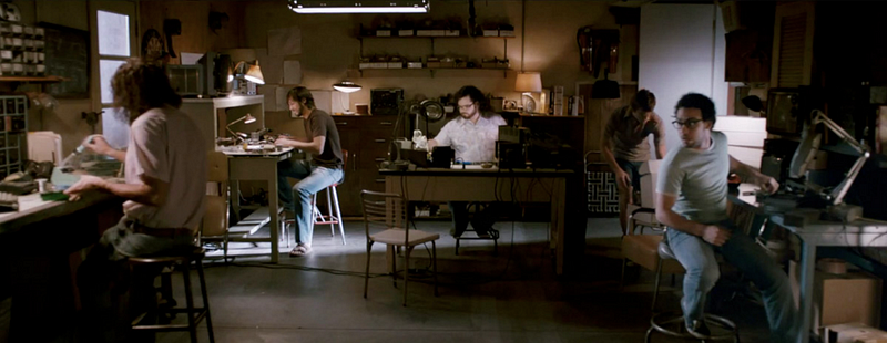
An idea is born somewhere relatively obscure (maybe in a garage somewhere), spreads to small communities of hardcore enthusiasts (like Kickstarter and Reddit), and sometime later takes the mainstream by surprise when it suddenly explodes into popularity.

The journey is familiar in the context of startups, but it applies to important ideas and technologies more broadly.

Credit: Jobs (2013) http://www.imdb.com/title/tt2357129/

One example is bitcoin, which began as an interesting whitepaper published in 2008 that was circulated among cryptography experts for a few years before coming to the attention of the mainstream startup community. Now, it’s a cryptocurrency — and blockchain protocol — sensation where activity is being tracked closely and community splits are being chronicled by newspapers around the world including the New York Times. (The first mention of bitcoin there was actually four years ago, in the context of the TV show “The Good Wife”).

There are countless reasons why you’d want to know about the next big idea in technology, and as early as possible. Whether you’re finding them, inventing them, or building businesses based on them, ideas matter, as does “the idea maze” one travels to get to them. But is there a way to catch these ideas as they emerge, in their very early stages?It’s difficult, because the places where these sleeper trends begin are seemingly random and obscure. This is tautological in a way, because if something exciting comes out of an established tech center (like Stanford or MIT), the mainstream will pay attention very quickly. It’s only ideas that are significant and come from outsiders that take longer to surface and be understood.

Spotting these ideas has an element of serendipity and luck to it, but there are some things we can all do to improve our chances of finding an important trend before it hits the mainstream. The techniques aren’t different from what 1990s “coolhunters” or media and marketing trendspotters do to find pop culture trends early: It’s one part looking in the right places and cultivating the right sources, and one part noticing anomalies and acting quickly.

Where new ideas come from

The places where sleeper trends begin are by definition unpredictable, so it’s important to cast a broad net among interesting discussion groups orhobbyist communities — virtual or physical — that seem like good incubators for new ideas.

The next step is to keep track of what these groups are doing by setting up streams of information about them — anything from subscribing to newsletters and discovering good blogs in that space, to attending meetups and conferences.

One of the best ways to stay informed is by building a network of “social gateways”, people who are well connected in the communities you want to watch but that are also far enough outside your usual network that you are hearing about new things. Then, when a particularly compelling idea surfaces, you will hear about it early.

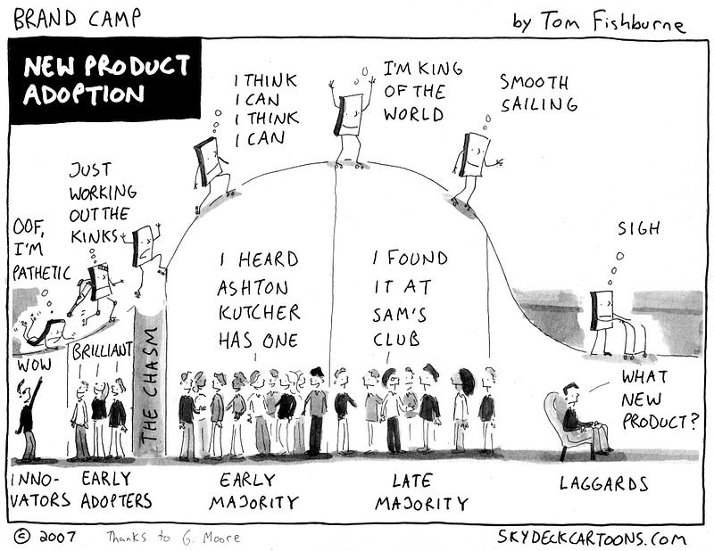
Some communities are far more likely to produce winning ideas than others. In his classic work The Diffusion of Innovations, sociologist Everett Rogers describes the characteristics of so-called “early adopters” — people who are more likely to find and use new technology.

These people are usually open-minded and scientific in their mindset, and have time or money to spend on trying new things. Any group with these characteristics is a good place for technologies to germinate, which is perhaps why college campuses make great testbeds for not only spotting but trying out new products.

According to Rogers, the best groups of early adopters are extroverted and have lots of social ties, because the more connected they are, the faster new ideas spread through the group. This is why trends often start with young people in cities, rather than in sprawling suburban neighborhoods, even though the latter group may be just as willing to try out the same new things.

Highly connected groups can be either offline (densely populated cities or other clusters) or online (tight-knit online communities). A really good sign of such a highly connected group is one that has with a newly formed, makeshift online presence, like a dedicated Slack channel or fast-growing subreddit (r/nameofgrouportopic). That usually means the group is both new and highly connected.

The number of small groups where ideas could surface is too large to watch them all, so it may be preferable to look further along the path, where ideas collect — in communities that aren’t very big, but have outsized importance or influence. The places to watch aren’t so much “gatekeepers” or curators of culture, like influential editors, as they are tastemakers.

The ‘banana album’ (Source: https://www.flickr.com/photos/isherwoodchris/5982207129/)

A good analogy is what happened with The Velvet Underground’s “banana album” (so called because of the pop art banana cover by Andy Warhol); while the album only sold 30,000 copies in its early years, the people who bought it were the kind of people who started bands. It ended up “influencing the influencers” despite being relatively unknown.

The tech equivalent of people-who-start-bands are programmers and developers, which is why sites like StackOverflow and Hacker News — where those groups congregate — are good places to watch for trends. If a tool or technology is especially popular with the best engineers, it’s worth watching those forums. The opinion of programmers often determines whether a technology gets built or not, or whether it comes through in startup recruiting or through open source development. It’s hard to imagine Linux being as successful as it has been — without the willingness of enthusiastic developers dedicating hours of their free time in the early years.

‘Live free or die’ Linux license plates (Source: https://www.flickr.com/photos/eggplant/17251516/in/photolist-2wqgW-h9MPAj-4rjVPB-bqNRs6-7emrfT)

How to tell a trend from a fad

Once you’ve built a pipeline of promising groups and information sources, how do you decide which ones are worth paying attention to?

With breakout ideas in particular, the most important thing to notice are signs of rapid growth. If you have the data, anything over 5% weekly sustained growth is anomalous and worth paying attention to. The next best thing is to compare leading versus lagging indicators, because a big mismatch between the two is often a sign of rapid growth.

Lagging indicators are things like brand recognition, prestige, and perceived importance. Leading indicators are more intrinsic to the idea or product itself, like how much their users care about it, how much better it is than the alternatives, and the volume of positive chatter about it. An example of lagging indicators outweighing leading indicators could be a film like Avatar, which had lots of marketing spend behind it, but appears to have had relatively limited cultural impact.

When I came across early but rapidly growing trends, like bitcoin in 2011, or the Oculus Kickstarter, they felt incongruous. In both communities, users and developers were going crazy for the new technology, which seemed to be a real breakthrough. Both trends seemed way too important to be something nobody outside the niche seemed to care about. In other words, the leading indicators far outstripped the lagging ones.

The natural instinct for most people is to ignore or dismiss this feeling, but you can train yourself to pay attention to it. In these cases it’s important to act quickly, because if something’s growing really fast, it’ll be common knowledge quite soon.

How to spot an important trend

In the early days of a new idea, it’s often the case that nobody is paying for anything. One way of guessing at economic impact, is by looking at “proxy for demand” — how much people will pay for similar alternatives — and on the other side, looking at “proxy for supply” — how expensive something was to produce before.

But it’s still tricky, because it’s so hard to estimate the economic changes brought by a disruptive technology. It can be dangerous to dismiss or embrace trends solely for this reason.

Finally, while rapid exponential growth is a good sign, it’s not everything. Internet memes have huge growth as well. Most ideas that quickly attract a large audience are actually just fads, and it’s important to be able to pick out the important ones. One good sign is evidence of a “secret”, a real discovery, or some plausible reasoning why this idea couldn’t have manifested itself before now. With bitcoin, the secret is the technical breakthrough described in the bitcoin paper; where previous efforts at distributed trust and decentralized resourcing failed, it coupled bitcoin (incentives) with the blockchain protocol (distributed ledger) to solve those problems.

Of the fast growing, real trends, only a few have the potential to be really, dramatically, world-changing. Every year, there are only a few really important macro trends, and just a handful of them in computer science. It’s unlikely a tech trend will be significant unless it benefits from one of these larger shifts, though it can do so in an oblique way. For instance, ridesharing apps were an important trend, but they were only enabled more broadly and recently by the larger trend of smartphones everywhere.

How trends go mainstream

Having a breakthrough or a community of early adopters clearly isn’t enough. So how does one tell a trend — something that continues to spread — from a fad — something that flares briefly and dies? The key is it needs to spread beyond the group of early adopters to the rest of the world, and there needs to be a real pathway for this to happen.

Before the internet, this path was from metropolitan centers, through the suburbs to the rest of the population. For ideas that spread purely online, the path could be through a big aggregator site like Reddit. Another pattern is spread by institutional similarity: Facebook was able to easily spread from Harvard to clusters of students in other schools, because of the structural similarity of most universities to each other despite other differences they may have.

Another path is by latching on to a different fast-growing community. In the 1990s, one of the big marketing successes of Sprite was advertising to the hip-hop subculture before it became mainstream. This type of path is especially important in technology, as subcultures that go through massive exponential growth are common. Targeting fast-growing communities is a common strategy for startups who want to see their userbase grow. Mobile developers were a niche group in 2007, but are a large, mainstream developer community now — — yet the today’s community still retains many of the tastes and technology preferences of the old one. Coolhunters can take the same approach but in reverse, by looking at fast growing communities and seeing what they’re using.

Whatever the path from early adopters to the mainstream may be, there are some qualities that some early adopters have some qualities that help the idea spread. In the fashion world, social media marketers often target internet personalities who project an aspirational ideal, often by posting Instagram-style pictures of food, live events, etc.

In technology, the kind of person who others want to copy may fit a different profile — might be famous through open source, might be a prominent blogger — but must have the same kind of influence. The same principle can apply to groups; Python programmers could be more influential than Java programmers, for example.

A contrarian view

You can get quite far in spotting new ideas just by watching developers, people in major cities or schools, other early adopters and tastemakers… but that’s where everyone’s looking. Part of finding the right people and places to watch necessarily requires you to have an alternative but correct view of the world — to form hypotheses about what’s overrated and underrated.

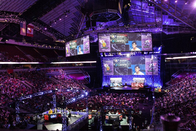
Gaming has been a good example of an underrated community for the last few years — despite little prestige, it’s a surprisingly large and influential subculture, and gamers have been early adopters of ideas like livestreaming and VR.

An esports match (Source: https://www.flickr.com/photos/samchurchill/14857571158/)

Why coolhunt?

Beyond any acquisitive value, finding tech trends also has broader applications. These ideas have huge, and often quite sudden, effects on the world, and it’s very difficult to tell in advance what they’ll be, or which industries they’ll affect the most. And while in an ideal world, futurists could rationally deduce what the next big trend will be- , the reality is that these systems are complex and more fluid, changes compound and build on each other, and there are lots of unknown unknowns to account for.

This means coolhunting can be a surprisingly good way to catch these monumental shifts, compared to traditional market research or deductive reasoning from experts. Not bad for a technique invented by ’90s fashion marketers!

What motivates students?

What can you learn when you reach out to 66,000 students to find out what motivates them?

For one, students who have a sense of purpose are 18 times as likely to be motivated to do their schoolwork as those who do not. Students who find their schoolwork engaging are 16 times as likely to be academically motivated as those who do not.

Russ Quaglia and the Qisa institute’s 2014 study on student voice analyzed student responses about Self Worth, Engagement, Purpose, Teacher Support, and Peer Support and cross-referenced the responses against Academic Motivation.

Below is a chart showing the increased likelihood of academic motivation based on students who feel they have the specific attribute. Thus, students who feel they have teacher support are 8 times as likely to be motivated to do their schoolwork than students who do not.

Academic Motivation

A second measurement determined the percent of students who did not have a particular attribute, shown in the table below:

Student Lacking

Thus, more than half of all students reported that they had little peer support for studying.

Thus, if a teacher wanted to increase the motivations of the most students, she would find interventions that would encourage students to support each other in studying.

Or, if a teacher wanted to have the greatest effect on specific students, she might help those students who needed it (about 15% of the students) find a purpose.

What are the interventions that have the largest effect?

While there may not be one right answer, it’s something that is worth discussing.

Why Six Hours Of Sleep Is As Bad As None At All

Getting six hours of sleep a night simply isn’t enough for you to be your most productive. In fact, it’s just as bad as not sleeping at all.

3057465-poster-p-1-how-to-be-a-success-at-everythingwhy-six-hours-of-sleep-is-as-bad-as-none-at-all

Not getting enough sleep is detrimental to both your health and productivity. Yawn. We’ve heard it all before. But results from one study impress just how bad a cumulative lack of sleep can be on performance. Subjects in a lab-based sleep study who were allowed to get only six hours of sleep a night for two weeks straight functioned as poorly as those who were forced to stay awake for two days straight. The kicker is the people who slept six hours per night thought they were doing just fine.

This sleep deprivation study, published in the journal Sleep, took 48 adults and restricted their sleep to a maximum of four, six, or eight hours a night for two weeks; one unlucky subset was deprived of sleep for three days straight.

Subjects who got six hours of sleep a night for two weeks straight functioned as poorly as those who were forced to stay awake for two days straight.
During their time in the lab, the participants were tested every two hours (unless they were asleep, of course) on their cognitive performance as well as their reaction time. They also answered questions about their mood and any symptoms they were experiencing, basically, “How sleepy do you feel?”

WHY SIX HOURS OF SLEEP ISN’T ENOUGH
As you can imagine, the subjects who were allowed to sleep eight hours per night had the highest performance on average. Subjects who got only four hours a night did worse each day. The group who got six hours of sleep seemed to be holding their own, until around day 10 of the study.

In the last few days of the experiment, the subjects who were restricted to a maximum of six hours of sleep per night showed cognitive performance that was as bad as the people who weren’t allowed to sleep at all. Getting only six hours of shut-eye was as bad as not sleeping for two days straight. The group who got only four hours of sleep each night performed just as poorly, but they hit their low sooner.

The six-hour sleep group didn’t rate their sleepiness as being all that bad, even as their cognitive performance was going downhill.
One of the most alarming results from the sleep study is that the six-hour sleep group didn’t rate their sleepiness as being all that bad, even as their cognitive performance was going downhill. The no-sleep group progressively rated their sleepiness level higher and higher. By the end of the experiment, their sleepiness had jumped by two levels. But the six-hour group only jumped one level. Those findings raise the question about how people cope when they get insufficient sleep, perhaps suggesting that they’re in denial (willful or otherwise) about their present state.

WE HAVE NO IDEA HOW MUCH WE SLEEP
Complicating matters is the fact that people are terrible at knowing how much time they actually spend asleep.
According to the Behavioral Risk Factor Surveillance System survey, as reported by the CDC, more than 35% of Americans sleep less than seven hours in a typical day. That’s one out of every three people. However, those who suffer from sleep problems don’t accurately estimate how much they sleep each night.

If you think you sleep seven hours a night, as one out of every three Americans does, it’s entirely possible you’re only getting six.
Research from University of Chicago, for instance, shows that people are as likely to overestimate how much they sleep as underestimate it. Another sleep study published in Epidemiology, indicates people generally overestimate their nightly sleep by around 0.8 hours. The same study also estimates that for every hour beyond six that people sleep, they overestimate sleep by about half an hour. If you think you sleep seven hours a night, as one out of every three Americans does, it’s entirely possible you’re only getting six.

So no one knows how much or little they’re sleeping, and when they don’t sleep enough, they believe they’re doing better than they are.

Even just a little bit of sleep deprivation, in this case, six rather than eight hours of sleep across two weeks, accumulates to jaw-dropping results. Cumulative sleep deprivation isn’t a new concept by any means, but it’s rare to find research results that are so clear about the effects.

FIXING SLEEP: EASIER SAID THAN DONE
Figuring out how to get enough sleep, consistently, is a tough nut to crack. The same advice experts have batted around for decades is probably a good place to start: Have a consistent bedtime; don’t look at electronic screens at least 30 minutes before bed; limit alcohol intake (alcohol makes many people sleepy, but it can also decrease the quality and duration of sleep); and get enough exercise.

Other advice that you’ll hear less often, but which is equally valid, is to lose excess weight. Sleep apnea and obesity have a very high correlation, according to the National Sleep Foundation. What’s more, obese workers already suffer from more lost productive time than normal weight and overweight workers.

Other causes of sleep problems include physical, neurological, and psychological issues. Even stress and worry can negatively affect sleep. The CDC has called lack of sleep a health problem, and for good reason. Diet, exercise, mental health, and physical health all affect our ability to sleep, and in return, our ability to perform to our best.

Fixing bad sleep habits to get enough sleep is easier said than done. But if you’re functioning as if you hadn’t slept for two days straight, isn’t it worthwhile?

Jill Duffy is a writer covering technology and productivity. She is the author of Get Organized: How to Clean Up Your Messy Digital Life.

China’s education system leaves students woefully unprepared for the real world

rtr4wysj


Chinese kids are smart. The kids of Shanghai cleaners outperform those of British doctors and lawyers in math, and Shanghai’s richest students are about three academic years ahead of the developed-country average. Students in the 90th percentile in the US score below the average Shanghai student on a test given to 15 year-olds around the world (pdf).
But tests only tell you so much about Chinese students’ smarts, says Xiaodong Lin, a professor of cognitive studies at Columbia University’s Teachers College. When they come to university in the US, Chinese students tend to struggle with analytical writing, critical thinking, and communication with peers and professors, Lin wrote in the People’s Daily (link in Chinese), the official newspaper of China’s Communist Party.
“While Chinese education has focused more on mastery of knowledge, the American education seems to emphasize how to learn, even though we may not do as a good job as we wish,” she wrote.
Lin has taught college students in the US for 21 years, and told Quartz about she is constantly comparing her US and Chinese students. She has been the faculty adviser for the Chinese Student Association at Teachers College for 10 years, noting that she is “deeply in touch with the community.” She has surveyed other teachers about the differences between American and Chinese students, and writes about her findings frequently.

Global policymakers are equally obsessed with comparative student performance. The OECD gives 15-year-olds around the world a test every three years to track their progress in math, science, and reading; education ministers anxiously await the data and the praise or punishment that follows. But wherever they sit in the rankings, countries struggle to balance increased academic rigor against the reality that the modern workplace demands skills that aren’t reflected in tests.
Andreas Schleicher, head of the OECD’s education unit, told Quartz that the rest of the world can learn from the high standards that Chinese schools set for students, as well as the freedom teachers are given to adapt their methods to the subject matter. “They know how to teach,” he told Quartz. “It’s a science for them.” (Shanghai math teachers come to the UK every year to show off their talents.)
Lin agrees that this rigor is good—her Chinese students are better at deeper thinking than their American counterparts—but fostering independent thinking is also important. When she asked Chinese students why they were so quiet in class, the responses included statements like “my parents told me that I should not speak unless I have correct answers” and “I am afraid of speaking when my ideas are different from the class,” she wrote in the People’s Daily.
Other professors echoed Lin’s concerns. One from Northwestern University told her that that Chinese students work very hard but rarely produce original thoughts or ideas. “What they lack more is the ability to bring up viewpoints and justify them,” Lin wrote.

Design as Participation

You’re Not Stuck In Traffic You Are Traffic

This started with a drivetime conversation about contemporary design with Joi Ito. We were stuck in traffic, and in our conversation, a question emerged about designers: This new generation of designers that work with complex adaptive systems. Why are they so much more humble than their predecessors who designed, you know, stuff?
The answer is another question, a hypothesis. The hypothesis is that most designers that are deliberately working with complex adaptive systems cannot help but be humbled by them. Maybe those who really design systems-interacting-with-systems approach their relationships to said systems with the daunting complexity of influence, rather than the hubris of definition or control.
The designers of complex adaptive systems are not strictly designing systems themselves. They are hintingthose systems towards anticipated outcomes, from an array of existing interrelated systems. These are designers that do not understand themselves to be in the center of the system. Rather, they understand themselves to be participants, shaping the systems that interact with other forces, ideas, events and other designers. This essay is an exploration of what it means to participate.

Mies understood that the geometry of his building would be perfect until people got involved’

photo by Thomas Hawk. “Mies van der Rohe”. [https://www.flickr.com/photos/thomashawk/15281879105/]
If in 2016 this seems intuitive, recall that it is at odds with the heroic sensibility – and role – of the modern designer. Or the Modernist designer, in any case, in whose shadows many designers continue to toil. On the pre-eminent Modernist architect Mies Van der Rohe (director of the Bauhaus, among other legendary distinctions), Andrew Dolkart wrote: [1]
Mies understood that the geometry of his building would be perfect until people got involved. Once people moved in, they would be putting ornamental things along the window sills, they would be hanging all different kinds of curtains, and it would destroy the geometry. So there are no window sills; there is no place for you to put plants on the window. He supplied every single office with curtains, and all the curtains are exactly the same. And he supplied every window with venetian blinds, and the blinds open all the way, or they close all the way, or they stop halfway—those are the only places you can stop them, because he did not want venetian blinds everywhere or blinds set at angles.
The circumstances that led to such a position and practice – and the legacies that emerge from it – could be summarized in the question I have asked in every architecture review I’ve participated in: if tv shows have viewers, and cars have drivers, and books have readers, what word do architects use for the people who dwell in the buildings they make?

The Birth of the User

I haven’t met an architect with an answer to that yet and this isn’t really about architecture. Really. But in the meantime – in stark relief to the absence of the architectural term – the internet provided a model so useful that it sweeps across viewers, drivers, passengers, writers, readers, listeners, students, customers… bending all of these into the expressions of the user.
It’s hard to say exactly when the user was born, but it might be Don Norman at Apple in 1993 (referenced by Peter Merholz[2]):
“I invented the term [User Experience] because I thought Human Interface and usability were too narrow: I wanted to cover all aspects of the person’s experience with a system, including industrial design, graphics, the interface, the physical interaction, and the manual.”
In the 23 years since then, users have become the unit of measurement for entrepreneurial success. Like all units of measurement, it has acquired barnacle-like derivatives like MAU (monthly average users) and ARPU (average revenue per user.) If something has more users, it’s more successful than something with fewer users. If a user spends more time with something, it’s better than something they spend less time with.
To gain users – and to retain them – designers are drawing upon principles also set forth by Don Norman, in his 1986 “The Psychology of Everyday Things.” In the book, Norman proposes “User Centered Design” (UCD) which is still in active and successful use 20 years later by some of the largest global design consultancies.
Broadly, UCD optimizes around engagement with the needs, desires and shortcomings of the user (in stark opposition to, say, Mies van der Rohe) and explores design from the analysis and insight into what the User might need or want to do. Simply, it moves the center from the designer’s imagination of the system to the designer’s imagination of the user of the system.
Joe and Josephine, Henry Dreyfuss Associates 1974 (MIT Press) — you’ve never met them, but if you’re seated, you’re basically sitting in their chair.
In 2016, it’s nearly impossible to imagine a pre-user Miesian worldview generating anything successful. Placing human activity at the center of the design process – as opposed to a set of behaviors that must be controlled or accommodated – has become an instinctive and mandatory process. Aspects of this pre-date Norman’s “user,” e.g., Henry Dreyfuss’ “Joe and Josephine” (above) for whom all his products were designed. But where Joe and Josephine had anatomy, users have behavior, intention, desire.
It’s not the technical capacities of the internet; without UCD, Amazon couldn’t have put bookstores out of business, “ride-hailing” services couldn’t have broken the taxi industries in cities where they roll out, and digital music would never have broken the historical pricing and distribution practices of the record labels. Designers are appropriately proud of their roles in these disruptions; their insights into user desire and behavior are what made them possible.
But as designers construct these systems, what of the systems that interact with those systems? What about systems of local commerce and the civic engagement that is predicated upon it? Or the systems of unions that emerged after generations of labor struggles? Or the systems that provided compensation for some reasonable number of artists? When designers center around the user, where do the needs and desires of the other actors in the system go? The lens of the user obscures the view of the ecosystems it affects.
Robin Sloan recently addressed this in a post [3] about “Uber for food” startups like Sprig.
“[T]here’s more to any cafeteria than the serving line, and Sprig’s app offers no photograph of that other part. This is the Amazon move: absolute obfuscation of labor and logistics behind a friendly buy button. The experience for a Sprig customer is super convenient, almost magical; the experience for a chef or courier…? We don’t know. We don’t get to know. We’re just here to press the button.”
For users, this is what it means to be at the center: to be unaware of anything outside it. User-Centric Design means obscuring more than it surfaces. Sloan continues:
“I feel bad, truly, for Amazon and Sprig and their many peers—SpoonRocket, Postmates, Munchery, and the rest. They build these complicated systems and then they have to hide them, because the way they treat humans is at best mildly depressing and at worst burn-it-down dystopian.”
I have no idea what’s going on here but this is what I’m trying to say.
The user made perfect sense in the context in which it was originally defined: Human-Computer Interaction. UCD emphasized the practical and experiential aspects of the person at the keyboard, as opposed to the complex code and engineering behind it.
But we are no longer just using computers. We are using computers to use the world. The obscured and complex code and engineering now engages with people, resources, civics, communities and ecosystems.Should designers continue to privilege users above all others in the system? What would it mean to design for participants instead? For all the participants?

Designing for Participation.

Designing for participation is different than designing for use, in any case. Within architecture – which I refer to again precisely because participation is not native to the discipline – the idea emerged with increasing frequency as surfaces and materials took on greater dynamism. But perhaps the quintessential historical example is Cedric Price, who was working long before that dynamism was practical.
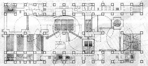
Cedric Price’s ‘Fun Palace’ (1961) and if you’ve ever been to the Pompidou Center in Paris, you’re looking at what happens when this idea puts on a suit and gets a job.

photo by Anil Bawa-Cavia. “Fun Palace”. [https://www.flickr.com/photos/kontent/1038454094]
Price is well known for two projects: Fun Palace (1961) and Generator (1976) and though neither one was ever built, their genes can be isolated in the Centre George Pompidou and the so-called “smart home.” The Fun Palace (drawing, above) writes Stanley Matthews [4],
“…would challenge the very definition of architecture, for it was not even a conventional ‘building’ at all, but rather a kind of scaffold or framework, enclosing a socially interactive machine – a virtual architecture merging art and technology. In a sense, it was the realization of the long unfulfilled promise of Le Corbusier’s claims of a technologically informed architecture and the ‘machine for living’. It was not a museum, nor a school, theatre, or funfair, and yet it could be all of these things simultaneously or at different times. The Fun Palace was an environment continually interacting and responding to people.”
Designed in 1961, the Fun Palace in free exchange with many contemporaneous ideas, cybernetics not least of all. The Fun Palace was, writes Matthews, “like a swarm or meteorological system, its behaviour would be unstable, indeterminate, and unknowable in advance.”
This was wholly in line with the early cyberneticists like Gordon Pask (who noted in 1972, “now we’ve got the notion of a machine with an underspecified goal, the system that evolves…”)[5] But Price’s architecture was more than contemporary to cybernetics: it was infected by them. Pask himself organized the “Fun Palace Cybernetics Subcommittee.”
The Fun Palace was obviously quite radical as architecture, but far beyond its radical architectonic form (some of which was adopted by the Pompidou Center) was its more provocative proposal that the essential role for its designer was to create a context for participation.
This returns to the drivetime question about the designers of complex adaptive systems: Price was designing not for the uses he wished to see, but for all the uses he couldn’t imagine. This demands the ability to engage with the people in the building as participants, to see their desires and fears, and then to build contexts to address them. But it wasn’t strictly about interaction with the building; it was a fundamentally social engagement. As opposed to the “user” of a building who is interacting with a smart thermostat, the participants in a building are engaged with one another.
The social systems, however, are only one of many complex systems within which the Fun Palace is expressed. It stood outside any context of urban planning, or really any interaction with a broader system-based context (in which it is only a building, as opposed to a whole world.) It was designed for participants, but it denied that the building was participating in complex adaptive systems that were far greater than itself.
as best I know, this is pretty much what Cedric Price wanted to see happening in the Fun Palace
The Living/David Benjamin. “Hy-fi”. [http://thelivingnewyork.com/hy-fi.htm]
When the methodologies of design and science infect one another, however, design is not just a framework for participants, but something that is also, itself, participating. In the 2015 Hy-fi, a project for MoMA/PS1 by The Living (David Benjamin, above), it’s possible to see the various systems in active play. Analogous to Price’s Fun Palace, Hy-fi is a framework for participation, rather than a series of prescriptive uses.[6]
Hy-fi, however, is much more than the Price-like sensibilities that emphasize adaptability and context over structure and use. The materials used in Hy-fi are an innovative 100% organic material, manufactured from discarded corn stalks and bespoke “living root-like structures from mushrooms.” David Benjamin’s design of this material is inextricable from his design of the building. Hy-fi sits at one intersection between building and growing, rendering it as close to zero-carbon-emission development as anything we’ll find in New York City.

growing a building, 2015.

Ecovative. “Timelapse of Myco Foam bricks growing for Hy-Fi”. [https://www.youtube.com/watch?v=vIb7tQcTKJU]
It’s not as simple as a kindness towards the planet, though indeed, it’s a love letter to earth. Here is a building that is composted, instead of demolished. Hy-fi rethinks what the building is and does, relative to its participation with the complex adaptive systems around it. From the MoMA summary:[7]
“The structure temporarily diverts the natural carbon cycle to produce a building that grows out of nothing but earth and returns to nothing but earth—with almost no waste, no energy needs, and no carbon emissions. This approach offers a new vision for society’s approach to physical objects and the built environment. It also offers a new definition of local materials, and a direct relationship to New York State agriculture and innovation culture, New York City artists and non-profits, and Queens community gardens.”

composting a building, 2015

In other words, it’s not as simple as making sure that people are participating with the building (as Pask and Price conspired to do over 50 years ago.) Rather, the building is explicitly designed to participate in the built environment around it, as well as the natural environment beyond it, and further into local manufacturing, gardens and agriculture.
This is the designer working to highlight the active engagement with those systems. This is the alternative to the unexamined traditions of User-Centric Design, which renders these systems as either opaque or invisible.

Design as Participation.

To see this all the way through, designers can be reconsidered – in part through the various lenses of science – to become participants themselves.
Special participants, perhaps, but see above: the subject of the MoMA text is “the natural carbon cycle” that is diverted by the designer. The designer is one of many influences and directives in the system with their own hopes and plans. But mushrooms also have plans. The people who dance inside them have plans. And of course the natural carbon cycle has plans as well.
This recalls Ian Bogost’s take on Object Oriented Ontology (OOO), which he characterized succinctly in 2009[8]:
Ontology is the philosophical study of existence. Object-oriented ontology (“OOO” for short) puts things at the center of this study. Its proponents contend that nothing has special status, but that everything exists equally—plumbers, DVD players, cotton, bonobos, sandstone, and Harry Potter, for example. In particular, OOO rejects the claims that human experience rests at the center of philosophy, and that things can be understood by how they appear to us. In place of science alone, OOO uses speculation to characterize how objects exist and interact.
Some contemporary work suggests that we are not only designing for participation, but that design is a fundamentally participatory act, engaging systems that extend further than the constraints of individual (or even human) activity and imagination.
This is design as an activity that doesn’t place the designer or the user in the center.
Hans Haacke, ‘To the Population’ (Der Bevolkerung). Inside the Reichstag. This is Germany.
Hans Haacke’s 2000 monument in the re-united German Reichstag – To the People, der Bevoelkerung – requested all the members of the German Parliament to collect soil from their various local regions, and deposit the dirt untouched, within the monument. What grows must be nurtured, collectively designated as the federal representation of Germany … on into the future, growing year by year. There are no brick-like constraints, as in Hy-fi. There is only a structural context for the complex – and wholly unpredictable – interaction of soil, seeds, water, and sunlight. Germany.
Maria Theresa Alves, ‘Seeds of Change’ ballast garden in Bristol. This is Bristol, which is to say: this is everywhere that Bristol went.
More recently, the Brazilian artist Maria Theresa Alves worked in Bristol England to identify “ballast seeds”: the seeds that were inadvertent stowaways in the colonial period, when sailors would load rocks for ballast in their ships. The rocks came from wherever they happened to land, to stabilize them on their way to wherever they were gong. In “Seeds of Change” (2015) she nurtured the reverse-colonizers of Bristol: marigolds from the Mediterranean, tassel flowers from the New World. These arrived quietly below the water line, silent migrants from centuries ago.
Alves happens to have started Brazil’s Green Party, which situates the work in a broader practice of participation. But in Bristol, she surfaces the complex systems that lie below deck, systems that are derivative effects of commerce, colonialism, and the dynamics of life at sea. It’s humbling to wander inside it, a reminder that it’s not always obvious who exactly colonizes whom.
The final work here is by the art and design collective Futurefarmers, started by Amy Franceschini in 1995. Famous to some for designing the logo for Twitter – itself an exercise in representing participatory engagement – much of their work centers around building infrastructure for participation. Some of the participation is between people, but much of it is with the complex natural systems that surround us. Their recent project “Flatbread Society: Land Grant 2014” is described by the Broad Art Museum[9] as:
“… a project that brings together farmers, oven builders, astronomers, artists, soil scientists, bakers, anthropologists, and others who share an interest in humankind’s long and complex relationship with grain.”
The work includes a flexible space for discussion and interaction (modeled after the trading floor of the Chicago grain exchanges) but more importantly, it also includes seeds that Futurefarmers have gathered from around the world, grains thought to be either extinct or useless. Further, there’s an oven. The grains are baked into flatbread together with anyone who cares to learn.
In the Flatbread Society work, like the work of Haacke and Alves, human activity can clearly be understood as only one of the systems that is in play. This is the inversion of User Centric Design. Rather than placing the human at the center of the work, the systems that surround us – systems we depend on – take the appropriate center stage in their complexity, mystery, in their unpredictability.

You’re Not Stuck In Traffic You Are Traffic

Small detail from Chris Burden’s ‘Metropolis II’ at LACMA. Every artist’s landscape captures a place, and a precise moment in time. This is America, and this precise moment is the 20th century.
This started with a drivetime conversation about contemporary design with Joi Ito. We were stuck in traffic.
At the time, I remember thinking about David Foster Wallace, his essay and commencement address entitled “This is Water,” [10] and how he appealed to the students he was addressing:
“…I can spend time in the end-of-the-day traffic jam being angry and disgusted at all the huge, stupid, lane-blocking SUV’s and Hummers and V-12 pickup trucks burning their wasteful, selfish, forty-gallon tanks of gas, and I can dwell on the fact that the patriotic or religious bumper stickers always seem to be on the biggest, most disgustingly selfish vehicles driven by the ugliest, most inconsiderate and aggressive drivers, who are usually talking on cell phones as they cut people off in order to get just twenty stupid feet ahead in a traffic jam, and I can think about how our children’s children will despise us for wasting all the future’s fuel and probably screwing up the climate, and how spoiled and stupid and disgusting we all are, and how it all just sucks, and so on and so forth…
Look, if I choose to think this way, fine, lots of us do — except that thinking this way tends to be so easy and automatic it doesn’t have to be a choice. Thinking this way is my natural default-setting. It’s the automatic, unconscious way that I experience the boring, frustrating, crowded parts of adult life when I’m operating on the automatic, unconscious belief that I am the center of the world and that my immediate needs and feelings are what should determine the world’s priorities.”
There will always be designers to design the Hummers and the bumper stickers, and there will always be designers to design the web sites to propagate David Foster Wallace’s warnings and promises.
But a new generation of designers has emerged, concerned with designing strategies to subvert this “natural default-setting” in which each person understands themselves at the center of the world.
These designers do this by engaging with the complex adaptive systems that surround us, by revealing instead of obscuring, by building friction instead of hiding it, and by making clear that every one of us (designers included) are nothing more than participants in systems that have no center to begin with. These are designers of systems that participate – with us and with one another – systems that invite participation instead of demanding interaction.
We can build software to eat the world, or software to feed it. And if we are going to feed it, it will require a different approach to design, one which optimizes for a different type of growth, and one that draws upon –and rewards – the humility of the designers who participate within it.
EOM.
(If you didn’t come here through the MIT Media Lab’s Journal of Design and Science, you may find it has deeper context there.
Many conversations led to this, most notably with Daisy Ginsberg as well as Kenyatta Cheese, Tricia Wang, Joe Riley, Karthik Dinakar, Joi Ito, and other friends, colleagues, participants.)
Add to Comment

References

[1]photo by Anil Bawa-Cavia. “Fun Palace”. [https://www.flickr.com/photos/kontent/1038454094]
[2]Usman Haque. “The Architectural Relevance of Gordon Pask”. Architectural Design. Vol. 77. (2007): Num. 4. 54.[http://www.haque.co.uk/papers/architectural_relevance_of_gordon_pask.pdf] original quote in Mary Catherine Bateson Our Own Metaphor: A Personal Account of a Conference on the Effects of Conscious Purpose on Human Adaptation. New York : Alfred A Knopf
[3]Ecovative. “Timelapse of Myco Foam bricks growing for Hy-Fi”. [https://www.youtube.com/watch?v=vIb7tQcTKJU]
[5]photo by Thomas Hawk. “Mies van der Rohe”. [https://www.flickr.com/photos/thomashawk/15281879105/]
[6]Ian Bogost. “What is Object-Oriented Ontology? A definition for ordinary folk”. bogost.com. (2009):[http://bogost.com/writing/blog/what_is_objectoriented_ontolog/]
[8]David Foster Wallace. “This is Water”. (2005): [http://web.ics.purdue.edu/~drkelly/DFWKenyonAddress2005.pdf]
[9]Andrew Dolkart. “The Skyscraper City”. The Architecture and Development of New York City. (2003):[http://ci.columbia.edu/0240s/0242_3/0242_3_s6_4_tr.html]
[10]“The Land Grant: Flatbread Society”. Broad Art Museum MSU, [http://broadmuseum.msu.edu/exhibitions/land-grant-flatbread-society]
[11]Peter Merholz. “Whither “User Experience”?”. peterme.com. (1998): [http://www.peterme.com/index112498.html]
[13]The Living/David Benjamin. “Hy-fi”. [http://thelivingnewyork.com/hy-fi.htm]
[14]Robin Sloan. “Why I Quit Ordering From Uber-for-Food Start-Ups”. The Atlantic.[http://www.theatlantic.com/technology/archive/2015/11/the-food-delivery-start-up-you-havent-heard-of/414540/]
[15]Stanley Mathews. ” The Fun Palace: Cedric Price’s experiment in architecture and technology”. Technoetic Arts: A Journal of Speculative Research. Vol. 3. Intellect Ltd, (2005): Num. 2.[http://www.bcchang.com/transfer/articles/2/18346584.pdf]
[16]The Living/David Benjamin. [http://thelivingnewyork.com/hy-fi.htm]