40 more maps that explain the world
BY MAX FISHER
Maps seemed to be everywhere in 2013, a trend I like to think we encouraged along with August’s 40 maps that explain the world. Maps can be a remarkably powerful tool for understanding the world and how it works, but they show only what you ask them to. You might consider this, then, a collection of maps meant to inspire your inner map nerd. I’ve searched far and wide for maps that can reveal and surprise and inform in ways that the daily headlines might not, with a careful eye for sourcing and detail. I’ve included a link for more information on just about every one. Enjoy.
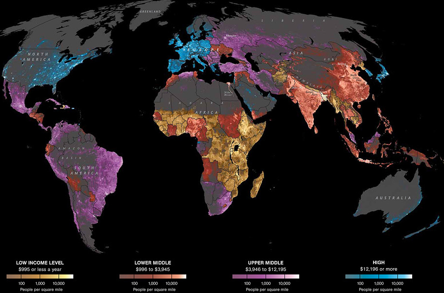
1. Where the world’s people live, by economic status
Those dots represent people: the brighter the dot, the more people. The color shows their country’s average income level: blue is richest and yellow is poorest. I want to start with this map because it’s a reminder that the world is first and foremost made up of people; to me, the best maps are primarily about showing us people, not politics or geography. It’s also a way of looking at the divisions in the world other than by political borders; that’s a theme we’ll come back to. (One caveat to this map: it doesn’t show economic variations within countries, just the national averages.)
2. How humans spread across the world
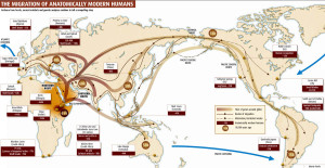
Human beings first left Africa about 60,000 years ago in a series of waves that peopled the globe. This map shows where those waves of migration went and when they occurred (the “40K” over Europe means humans arrived there about 40,000 years ago). You can see that humans have the most history in the Middle East, India and of course Africa itself (the map does not show the much longer history of migration within Africa). We are relative newcomers to the Americas, one of the reasons it has not until very recently been as densely populated as other parts of the world.
3. When the Mongols took over the known world
The Mongol conquests are difficult to fathom. Although their most important technology was the horse, they conquered much of the known world from China to Europe, a series of wars that killed tens of millions of people, then a substantial chunk of the world’s population. The Mongols also established what may well have been the largest empire in history until the British surpassed them six long centuries later. It’s difficult to understate how much we still feel their impact today; the country we know of today as Iraq has never fully recovered from the 1258 sacking of Baghdad, which until then had been a center of global wealth and knowledge.
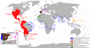
4. When Spain and Portugal dominated the world
This map shows the Spanish and Portuguese empires at their height. They didn’t hold all of this territory concurrently, but they were most powerful from 1580 to 1640, when they were politically unified. Portugal would later pick up more territory in Africa, not shown on the map. We often forget that Spain controlled big parts of Europe, in Italy and the Netherlands. In the Middle Ages, Spain and Portugal were so powerful that they signed a set of treaties literally dividing up the globe between them. They became so rich so quickly that their trade with the Ottoman Empire, perhaps the other great imperial power of the time, filled the Ottoman economy with more gold than it could handle and plunged it economy into an inflationary crisis so severe that the empire never fully recovered.
5. Major shipping routes in the colonial era
Data source: Climatological Database for the World’s Oceans (James Cheshire)
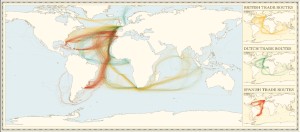
This map shows British, Dutch and Spanish shipping routes from 1750 to 1800. It’s been created from newly digitized logbooks of European ships during this period. (Unfortunately, the French data is not shown.) These lines are the contours of empire and of European colonialism, yes, but they’re also the first intimations of the global trade and transportation system that are still with us today. This was the flattening of the world, for better and for worse.
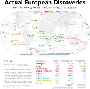
6. Actual European discoveries
Click to enlarge.
(Bill Rankin/Radical Cartography)
Americans have mostly come around to accept that, despite what our grade school teachers may have told us, Europeans did not “discover” America; the original arrivals had done that 15,000 years earlier. But Europeans did discover lots of land that had never been before seen by human eyes. You can, embedded in this map, see successive waves of European exploration: first the Portuguese, then the Spanish, then the British and much later the Americans. The map’s creator, the always-insightful Bill Rankin, writes, “this map particularly underscores the maritime expertise of Pacific Islanders. Unlike the islands of the Atlantic and Indian Oceans, nearly all of the Pacific was settled by the 14th century.”
7. How countries compare on economic inequality
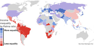
Bluer countries have better income equality. Redder countries are more unequal. Data: CGDev, DIIS (Max Fisher / Washington Post)
Yes, the United States has worse income inequality than Nigeria. That’s according to a metric called the Palma Ratio that measures economic inequality. Read more here about how the metric works and the fascinating results of using it to compare the world’s countries.
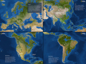
8. If the polar ice caps completely melted
Click to enlarge. (National Geographic © September 2013 National Geographic Society / Full source info here)
It’s not clear precisely when the polar ice caps will melt completely. But if and when they do, sea levels will rise by 216 feet. This map shows what the world would look like then. Given how many people live near coastlines today, that’s not good. You can see National Geographic’s wonderful, full interactive here.
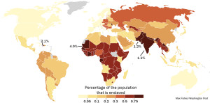
9. Where the world’s 30 million slaves live
Share of each country’s population that is enslaved. Data source: Walk Free Global Slavery Index. (Max Fisher/Washington Post)
This is not some soft, liberal, by-modern-standards definition of slavery. This is slavery. There are 30 million people living today as forced laborers, forced prostitutes, child soldiers, child brides in forced marriages or other forms of property. There are 60,000 right here in the United States – yes, really. This map shows the proportion of each country that is enslaved. It’s highest in Mauritania, a shocking four percent, due in part to social norms tolerating the practice. A little more than one percent of people in India are enslaved, which translates to 14 million Indians living as slaves today. You can see the breakdown by numbers of slaves here.
10. Our globalized economy: What it takes to make nutella
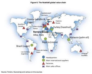
Click to enlarge. (OECD)
Put this map alongside No. 5 above, of European colonial-era shipping routes. This is the end product of today’s ultra-globalized economy. A simple jar of Nutella requires natural resources from four continents, vast manufacturing facilities in entirely different countries and a supply and distribution chain that spans the globe.
11. Where populations are growing and shrinking

Blue countries have growing populations; red countries are shrinking. Purple are growing slowly or not at all. Data source: United Nations Population Fund. Click to enlarge. (Max Fisher/Washington Post)
The world is in for some major demographic changes over the next generation or two. Populations are booming in Africa, growing faster than ever before, just as they’re slowing in Asia and outright shrinking in Japan and Eastern Europe. What’s most interesting about these population changes is what demographers say they will mean for the world’s political and economic future. For more, read: The amazing, surprising, Africa-driven demographic future of the Earth, in 9 charts.
The world is in for some major demographic changes over the next generation or two. Populations are booming in Africa, growing faster than ever before, just as they’re slowing in Asia and outright shrinking in Japan and Eastern Europe. What’s most interesting about these population changes is what demographers say they will mean for the world’s political and economic future. For more, read: The amazing, surprising, Africa-driven demographic future of the Earth, in 9 charts.
12. Walls of the world

Source: “Atlas des migrants en Europe. Géographie critique des politiques migratoires européenne,” Armand Colin. (Nicolas Lambert / MigrEurop)
A French non-governmental organization put together this map of the world’s major physical barriers – its most consequential walls. The red lines indicate walls and barriers meant to prevent or control immigration; you see a number of those particularly where there are rich countries next to poorer countries. The green walls are mostly political barriers, such as the 1,700-mile-long “Moroccan Wall” dividing Morocco-occupied Western Sahara, the West Bank separation barrier and the Korean demilitarized zone. No single map of something this controversial and sensitive is ever going to satisfy everyone, but it’s a fascinating glimpse into why and where we choose to limit human movement.
13. The Arctic land grab

As the polar ice caps melt, it’s creating something that the world hasn’t seen in a long time: vast, unclaimed territory. That territory also happens to include oil and other natural resources, as well as valuable trade routes. Five countries are competing to claim the new land: Canada, Russia, Norway, Denmark and the United States. How the Arctic land-grab resolves is so potentially important that even Canada is getting much more assertive.
14. Who wins Nobel prizes (and who doesn’t)

Click to enlarge. (Max Fisher/Washington Post)
It’s no secret that Europeans and Americans win most Nobel prizes. But just how much more is pretty astounding. When I looked into how the Nobel prizes have broken down over their century-plus history, I was surprised by the results, which you can see here illustrated in maps and charts. One of several facts from the data: More than one in every three Nobel laureates is from the United States. Put another way, the United States has 4 percent of the world’s population and 34 percent of its Nobel laureates.
15. The 17 countries that could have housing bubbles

The 17 countries identified as having potential housing bubbles. Click to enlarge. (Washington Post)
You probably remember the U.S. housing bubble burst of 2007 (it was pretty memorable). According to a recent economic estimate, a full 17 countries could face potential housing bubbles today. Alarmingly, that includes China, the world’s second-largest economy. Read more here on the countries at risk and what could happen if they burst.
16. The happiest and least happy countries

Data source: Columbia University’s World Happiness Report. Click to enlarge. (Max Fisher/Washington Post)
A recent study conducted by the United Nations and Columbia University attempted to infer happiness measuring a series of social metrics and survey results. Some of the results are unsurprising: wealth, health, political stability and economic equality all appear to coincide with happiness. But there are some real surprises in the data. Latin America and the Caribbean are, by this measure, the happiest on average in the world. Here’s why that might be and more lessons from the data.
17. All terror attacks worldwide in 2012

Click to enlarge. (Start GTD)
This study by the University of Maryland-based National Consortium for the Study of Terrorism and Responses to Terrorism tracked every single terrorist attack in 2012 (the most recent year for which all data was available). This should drive home how remarkably safe Americans are from terrorism today. It drives home who the real victims of terrorism are. And it reveals some of the global hotspots for terrorist activity and all the instability and mayhem that can bring. Some readers might be surprised to see how much terrorism there is, for example, in Nigeria, in Kenya and most especially in eastern India, where the Maoist “Naxalite” insurgency has been wreaking havoc for almost 50 years.
THE AMERICAS
18. North America’s languages, before colonialism

Click to enlarge. Data source: Ives Goddard. (Wikipedia Commons)
This a remarkable reminder of the diversity and cultural richness of North America before it was so completely transformed by the arrival of Europeans – to the terrible detriment of the societies that once proliferated here. It’s also a reminder that some of these societies had spread widely and established themselves deeply, despite the common American perception today of a mishmash of disparate and unconnected tribes.
19. Where place names come from in the Americas

This map shows the origin language for place names in the Americas. For example, the word “Texas” comes from the Caddoan language, of the Caddo people who lived in what is today East Texas. It’s a fascinating lens into the Americas’ history, of which Europeans arrived or conquered where, as well as a legacy of the people who lived here first. Bill Rankin, the map’s creator,has this chestnut: “‘Huron’ derives from a French slur for the hairy natives (it shares a root with ‘hirsute.’)”
20. American ancestry by county

Click to enlarge. (U.S. Census Bureau)
This map, which shows the dominant ancestry in each U.S. county, is a wonderful show of American diversity and a living museum of America’s history of immigration, voluntary as well as forced. There are countless stories embedded in this map, and not just American stories. Much of this immigration was driven by far-away wars, economic catastrophes, famines or other major historical events, most especially the trans-Atlantic slave trade. In that sense, America’s diversity – like this map showing it – is a global story.
21. What territory Mexican drug cartels control

Click to go to source. (Farhana Hossain and Xaquín G.V. / The New York Times)
This infographic shows which Mexican drug cartels control what territory. It’s a staggering indication of how powerful these groups have become, as well as a glimpse into the vast cartel economy they collectively run – one in which territory is especially important.
AFRICA
22. The empires of Africa, before colonialism

Click to enlarge. (Wikipedia)
This map of indigenous African empires is not exhaustive. It spans two thousands years from 500 B.C. to 1500 A.D., so these empires were not concurrent; some existed centuries apart. But it shows that, like with North America and perhaps even more so, sub-Saharan Africa was rich with vast and powerful empires long before the Europeans arrived. (One of the biggest, Ethiopia, was actually unusually and perhaps uniquely successful in resisting European imperialism.) The Songhai Empire, at its peak in the 14th century, was a global center of culture and learning, based in the still-famous mosques of Timbuktu.
23. What Africa might look like if it had never been colonized

Click to enlarge. (Nikolaj Cyon)
Historical counterfactuals aren’t much more than informed speculation, but this one is still awfully interesting. Made by the Swedish artist Nikolaj Cyon, the map asks what Africa would look like today if colonialism had never happened. (Africa’s present-day borders were determined largely by colonialism, which continues to create lots of very big problems.) Cyon drew these boundaries based on a study of political and tribal units in 1844, the eve of Europe’s “scramble for Africa.” He oriented it with south at the top to subvert the traditional Europe-on-top orientation. You can see it here with north on the top, if that’s easier for you to read.
24. The amazingly diverse languages of Africa

Data source: World Language Mapping System/Ethnologue. (Steve Huffman/WorldGeoDatasets)
This is another way of looking at and thinking about Africa’s divisions, without seeing them through the European-imposed colonial borders that we have today. Each shade is a language; each color is a group of languages. Yes, there are an awful lot of languages in Africa, reflecting the continent’s deep history and its diversity. You can see that a number of the borders, such as in Kenya or Cameroon or Nigeria, overlap big swathes of people who speak entirely different language families.
EUROPE
25. Europe, as mapped by tweets

Each color represents a different language. See global version linked below. (Kalev H. Leetaru, Shaowen Wang, Guofeng Cao, Anand Padmanabhan, and Eric Shook)
This shows tweets made in Europe in location and language between Oct. 23 and Nov. 30, 2012, with each language shown in a different color. It’s no surprise that more populous and richer countries have more tweets. But what’s most interesting is places where languages don’t quite line up with national borders. Look at all those German-language tweets in the parts of the Poland that once belonged to the German Empire. Or look at how Belgium seems to disappear, the French- and Dutch-speakers merging into France and the Netherlands. More on the findings here; click here for amuch larger version that shows the whole world and with the languages labeled.
26. How the Barbarian Invasions reshaped Europe

(Wikimedia commons)
Europe was completely reshaped in the third, fourth and fifth centuries. The Huns of far-Eastern Europe and Central Asia invaded Central Europe, destroying the Gothic kingdoms. Germanic tribes conquered much of Spain and North Africa. And, of course, the Visigoths of southeastern Europe sacked Rome in 410 A.D. All of this destroyed the Roman Imperial system, starting the dark ages. But it also sparked mass migrations throughout Europe that reshaped the continent in ways that are still with us.
27. When the Vikings spread across Europe

Click to enlarge. (Max Naylor/Wikimedia Commons)
A few hundred years later, the Vikings had their turn. We often forget just how far they spread. Red, orange and yellow shows areas under their control. Green shows areas where they frequently raided. The word “Russia” actually comes from the Rus tribe, who were descendants of Viking settlers. The “Vikings” who took over Sicily and southern Italy were actually Normans, Vikings who had conquered parts of Northern France, settled in, and then later sailed to Italy. Their descendants also included William the Conqueror.
28. World War II in Europe, day by day
This one speaks for itself and is a fascinating watch; there are countless stories embedded in these frames. If you enjoyed this, I would encourage you to watch this version that includes Asia and the Pacific as well.
29. The word for “bear” in European languages

Click to enlarge.
The Cold War taught us to think of Europe in terms of East-versus-West, but this map shows that it’s more complicated than that. Most Europeans speak Romance languages (orange countries), Germanic (pink) or Slavic (green), though there are some interesting exceptions.
30. People who die trying to immigrate to Europe

Click to enlarge. Data source: UNITED For Intercultural Action (Olivier Clochard/Migrinter)
This shows where and how people die trying to migrate into Europe. In October, when 300 would-be African immigrants to Europe died when their boat capsized off the Italian island of Lampedusa, it was seen as a sign ofhow dangerous and deadly migration paths into Europe had become. It’s a result of wide economic disparity between Africa and Europe as well as European policies to prevent immigration. It’s an ugly issue and, as this map shows, it kills many, many people every year.
THE MIDDLE EAST
31. The Islamic states of the world, from 1450 to today

(M. Izady/Gulf 2000 Project)
This doesn’t show all Muslim-majority countries – southeast Asia and parts of Africa aren’t included – but it does show the history of political borders and nation-states in most of the Islamic world from 1450 though today. You’ll notice themes of invasion and occupation, or empires rising and falling.
32. The 1916 European treaty to carve up the Middle East

Data source: The Gulf/2000 Project and United Nations ReliefWeb (The Washington Post)
In 1916, French, British and Russian diplomats signed an agreement to divide up the Ottoman Empire into areas of direct control and “spheres of influence.” It’s easy to overstate how big of a role this treaty actually playedin designing modern Middle East borders; in many ways, those divisions had already organically occurred during Ottoman rule. Still, it did fall along the Middle East’s problematic present-day borders, and you hear about that a lot today, so here it is.
33. The religious lines dividing today’s Middle East

Data source: The Gulf/2000 Project and United Nations ReliefWeb (The Washington Post)
Religious distinctions are deeply important for many of the problems in today’s Middle East, particularly between Sunni and Shia Muslims in Syria and Iraq. This map shows not just that those divisions cross of national borders, but that they’re all over the place. This is one of many reasons why these conflicts can be so persistent.
34. How the 1948 Arab-Israeli war helped lead to Israel’s borders

(Wikimedia commons)
Lots of maps show Israel’s territory from the 1967 Israeli-Arab war to the present, but I thought I’d show this map from the country’s 1947 founding onward. The leftmost map shows, in blue, Israel as established by United Nations resolution in 1947. Red shows the initial Arab state; green is the Arab state after the 1949 armistice. The center map shows the first months of the 1948 Israeli-Arab war and the advance of Arab armies to retake what they saw as rightful Arab land. The right-most map shows the advance of Israeli armies in the latter half of that war. At the end of fighting, Israel occupied much of what is considered Israeli land today.
ASIA
35. Percentage of Indian homes with toilets

Click to enlarge. Data source: Indian census, 2011 (Avinash Celestine / Data Stories)
India’s ongoing rise as a new economic powerhouse continues to be an amazing story. But much of the world’s second-most-populous country still lives in poverty or in otherwise difficult conditions. This map, created from census data by the designer Avinash Celestine, shows what percentage of families in each district have a toilet in their homes. As you can see, it’s less than half in huge swathes of the country, a reminder of how far India still has to go.
36. The languages of China and the surrounding area

Each shade is a different language; each color is a language group. Click to enlarge. Larger version linked below. (Steve Huffman / World GeoDatasets)
This map, for me, is a wonderful way to observe China’s very long history of expansion and consolidation. Remember that each shade is a different language. Even after thousands of years, Chinese itself remains remarkably diverse, particularly in the country’s dialect-rich southeast. And there are many entirely different language families: Mongolian in the north; the Turkic language Uighur in the West and; in southern Guangxi province, the Zhuang language that’s closer to Thai. This is another of Steve Huffman’s amazing creations; see a larger version here.
37. The WWII firebombing of Japan

Click to enlarge.
This map shows each Japanese city that was bombed during World War II, an American city of equivalent size, and the percentage of the city estimated destroyed by the bombings. All Americans learn about the two atomic bombs the U.S. dropped on Japan at the end of the war, and we’re starting to become more aware of the firebombing campaigns that wiped out much of Germany, including civilians. But we are nowhere near confronting the U.S. firebombing of Japan, which killed several times as many people as the atomic bombs and devastated Japan’s wooden-constructed cities. By the time the war ended, 30 percent of the residents in Japan’s largest 60 cities were homeless.
38. Territorial claims in the South China Sea

It’s no secret that China claims islands and maritime territory in the South China Sea that other countries see as theirs. But this map shows just how assertive China’s claim is – Beijing claims everything in red, a giant scoop of an area way, way beyond Chinese soil. China’s neighbors are very, very conscious of feeling a bit bullied, and this map shows why.
39. The naval firepower in the Pacific

Click to enlarge. (Cameron Tulk)
The Pacific Ocean, after being set on fire by World War II, is still heavily militarized. Japan, even though its U.S.-imposed constitution bans warfare and codifies pacifism, still has a pretty substantial navy. So does Russia, a legacy of the Cold War. And China’s is, of course, growing substantially. All of this combines with rising nationalism in East Asia, China’s not-misguided fear that the United States is attempting to contain them and growing concern about China itself.
40. Every airline flight in the world over 24 hours

This map shows every airline flight around the world during a single 24-hour day, looped endlessly. To me, it’s the perfect way to end. Even with no borders, you can still see so much of how the world is shaped. Where people are connected and not, where they are wealthier and not, how and where people have made social and economic connections and how deep they go.


